Logos are the visual face of a brand, representing its values, identity, and essence in a single image. Over time, logos have evolved reflecting the changing trends, target audience preferences, and brand repositioning strategies. In this blog post, we will delve into the logo evolution of six famous brands, exploring how their logos have transformed over the years to stay relevant and impactful.
How To Choose The Best Logo Font For Your Brand?
Guideline Choosing Logo Sizes For Social Media, Website, Print & Email Signatures
What Are Black And White Logos? Successful Brands With Black and White Logos
What Are Branding Colors? Guideline to Choosing the Perfect Branding Colors
What is Logo Evolution?
Logo evolution refers to the process of redesigning a brand's logo to adapt to changing times, resonate with the target audience, and maintain brand relevance. This transformation could involve subtle changes in color, font, and design elements, or a complete overhaul of the logo to reflect the brand's evolution and growth.
McDonald's Logo Design Evolution
One of the most well-known fast-food chains in the world, McDonald's, has had numerous changes to its logo over the years.
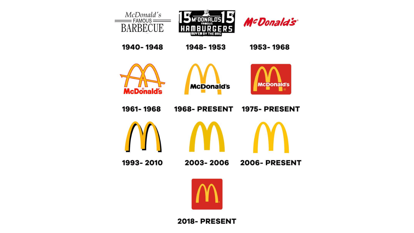
The first McDonald’s Logo was introduced in 1940 and featured the word “McDonald’s” in black lettering on a white background, with a single yellow arch over the top. The yellow arch was intended to represent the golden arches of the restaurant’s architecture.
Through the years, the McDonald’s logo has undergone a number of changes.
In 1953, McDonald's added a red background behind the arches
In 1961, the logo was updated with a more stylized M.
In 2003, a new look for its logo was introduced, featuring a more three-dimensional appearance and a subtle change to the coloring of the arches. In addition, McDonald's also began to use the slogan “I’m Lovin’ It” in its advertising campaigns, which was prominently displayed alongside the logo.
The current logo features the iconic golden arches that have become represented by this fast-food chain. The arches currently are slightly curved, and the company has removed the word “McDonald’s” from the logo altogether, allowing the arches to stand on their own.
Logo Evolution of Apple
Perhaps the most well-known brand in the world is Apple Inc., the company that brought us the MacBook, iPad, iPhone, iPod, and a host of other gadgets that have people camping outside of stores to get their hands on.
In 1976, the first Apple logo was designed by co-founder Ronald Wayne - a graphic designer. The logo featured Sir Isaac Newton sitting under a tree with an apple dangling above his head. The phrase “Apple Computer Co.” was written on the border surrounding the image. Apple's logo represents knowledge and creativity, with Newton representing the discovery of knowledge and the apple representing the fruits of knowledge.
In 1997, Apple hired a new designer named Rob Janoff. He designed a new logo featuring a rainbow-colored apple with a bite taken out of it. The logo colors were meant to represent creativity and innovation. The bite out of the apple was added to clarify that the logo represented an apple, not a tomato or another fruit.
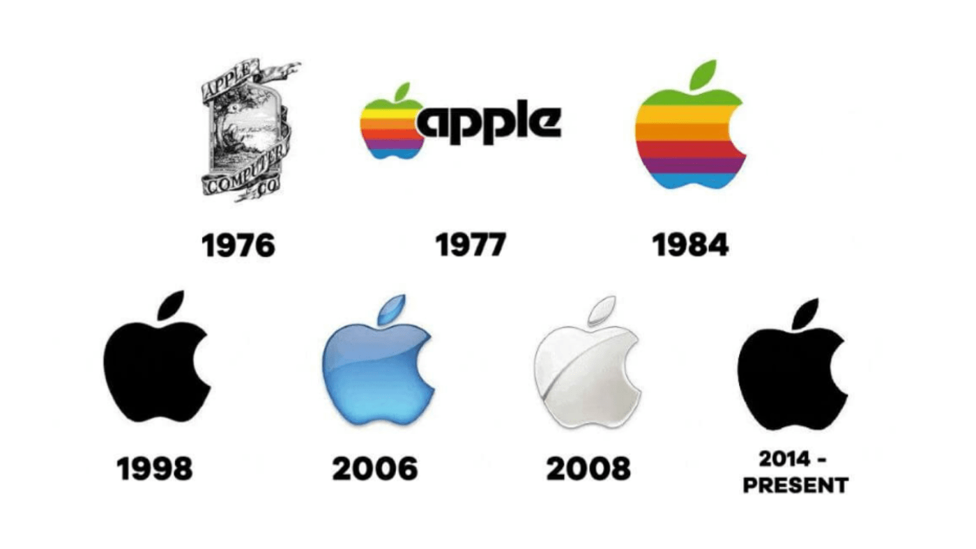
In 1998, Apple continued introducing a new logo design, the “Aqua” logo. The logo was more simplistic than the previous version, featuring a monochrome apple with a subtle 3D effect. This logo reflects the company’s new focus on design and aesthetics.
In 2001, another new logo design known as "Chrome" was introduced,. This version of the logo featured a shiny, metallic apple, which was designed to reflect the company’s new emphasis on hardware and technology.
A modernized version of the “Chrome” logo was introduced in 2017. The design features a flat, monochrome apple with a slightly rounded shape.
Coca-Cola Logo Evolution
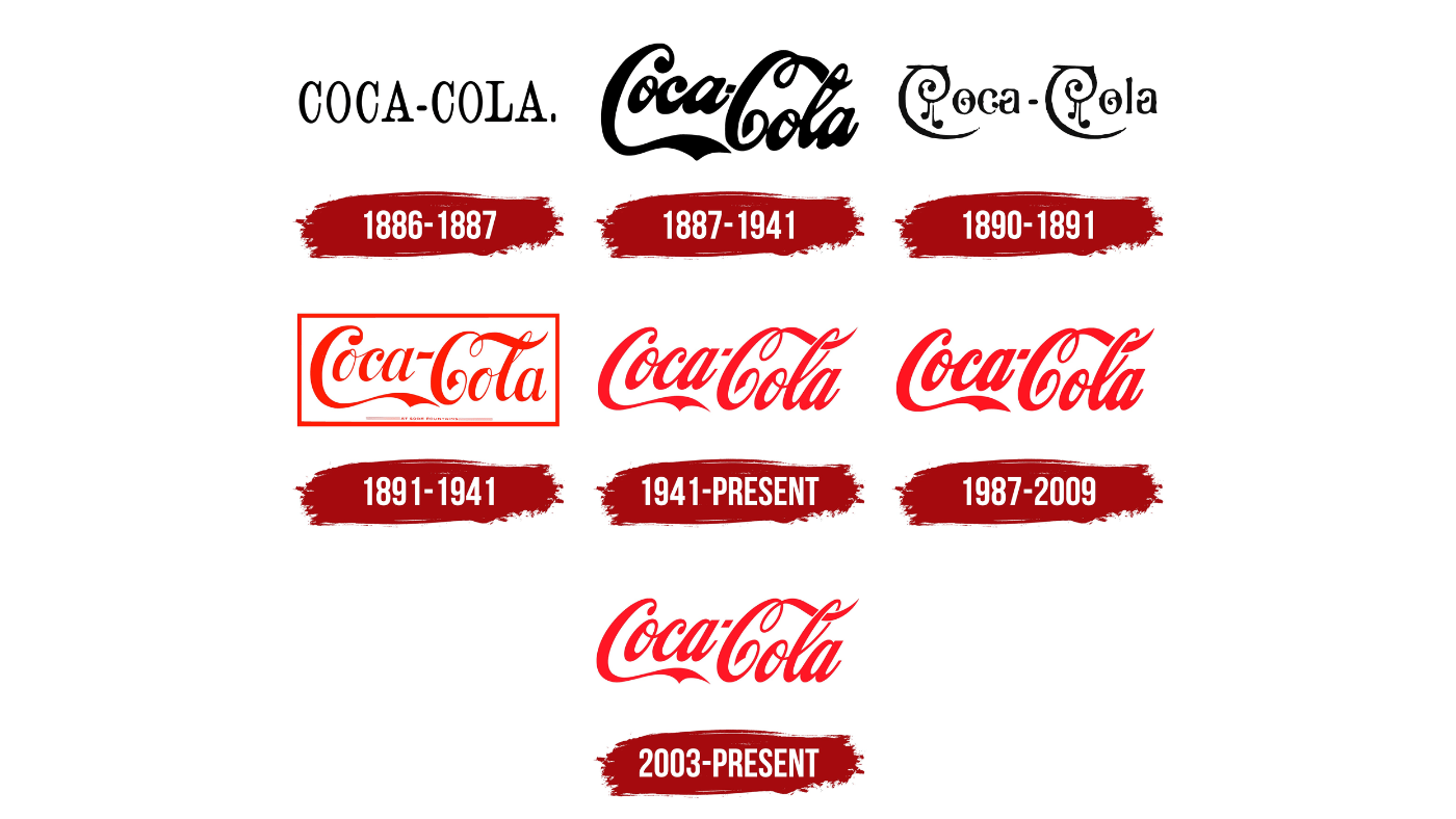
The logo of Coca-Cola was first created in 1887, two years after the company was founded. The logo font is Spencerian script, a popular style of handwriting in the late 19th century, and included the phrase “Delicious and Refreshing” underneath the logo.
This font gave the customers a sense of elegance and sophistication, which was intended to appeal to the middle and upper classes. The red and white color scheme represents purity and wholesomeness and makes the logo stand out on advertising materials.
The wave in the 1969 design has been slightly altered to give the current Coca-Cola logo a more modern appearance. The logo's typography has also been updated to a more modern sans-serif font.
Logo Evolution of Google
The most popular and widely used search engine worldwide is Google.
The first logo of Google was created in 1998 by Sergey Brin, one of Google’s co-founders. A simple, colorful logo with a stylized wordmark, featuring the word “Google” written in lowercase letters. Some primary colors are blue, red, and yellow. These colors evoke a sense of fun and playfulness.
1998-1999: A serif font with a distinctive drop shadow is a feature of Google's logo. However, the font was eventually changed to sans-serif font - a more modern in 1999.
2010: Google celebrated its 12th birthday with a special logo designed with a cake and the number “12” on it.
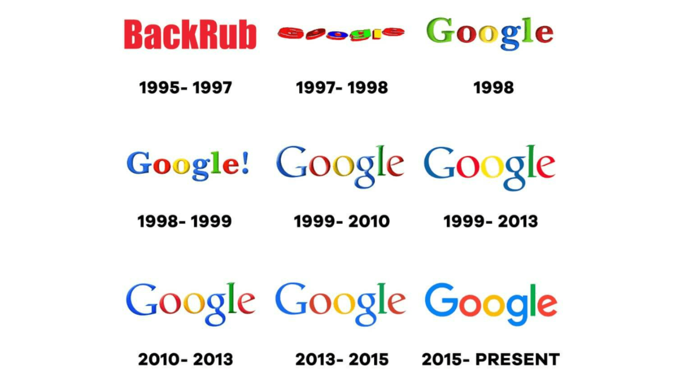
2013: Google's logo underwent a significant redesign, with the colors and letter shapes updated to create a flatter, more modern look. The logo also became more colorful, with the occurrence of a brighter shade of blue and green.
2015: A simpler and more geometric logo version was introduced. The new logo featured a sans-serif typeface called “Product Sans,” which was designed to be more legible on smaller screens.
2018: Google updated its logo once again, simpler and more streamlined. The company removed the drop shadow and gave the letters a more rounded look.
The current Google logo is a minimalist, sans-serif wordmark with red, blue, green, and yellow. The logo can be instantly recognizable and has become an iconic symbol of the company’s brand identity.
Logo Evolution of Adidas
Adidas is a multinational company based in Germany that creates and produces apparel, accessories, and shoes. Being one of the biggest producers of sportswear globally, it is well-known for its three-stripe emblem.
Adi Dassler, the company's founder, created the original Adidas logo in 1949. The word "Adidas" was written in bold letters above a slanted pattern of three stripes that made up the logo.
The first Adidas logo featured three stripes and the word “Adidas” written in bold lettering above it.
In 1967, a new logo was created featuring the three stripes enclosed in a triangle shape.
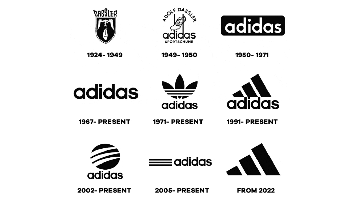
In 1971, the company introduced a new logo, which featured the same three stripes that were arranged in a parallel pattern.
In 1990, the company introduced a new logo, which featured the word “Adidas” in lowercase lettering, with the three stripes placed diagonally behind it.
In 1997, Adidas introduced a new logo, the word “Adidas” in lowercase lettering, with the three stripes placed diagonally behind it.
In 2014, a new logo was introduced, featuring a simplified design that emphasized the three stripes. The new logo was designed to be more flexible and adaptable for use across different media and platforms.
Conclusion
In conclusion, the logo evolution of these top six famous brands showcases the power of visual identity in shaping brand perception, connecting with consumers, and adapting to the evolving market trends. As brands continue to evolve and grow, their logos serve as a visual narrative of their journey, values, and aspirations. By understanding the significance of logo evolution, brands can stay relevant, engaging, and memorable in the ever-changing landscape of the business world.
Related Articles:
Four Key Factors For Evaluating Logo Quality
What Makes A Bad Logo Design? How Do You Know If A Logo Is Good Or Bad?
Top 6 Best Resources To Find Logo Ideas & Inspiration
What Are The 5 Elements Of A Good Logo? A Guideline for Business Owners


